
When we first started working in this space a couple of years back, we didn’t have the faintest idea what separated a good customer onboarding process from a bad one.
We learned, and we learned fast. And now, we make sure that customer onboarding processes are front and center for the SaaS customers we work with – because if you don't get it right, you'll burn the customer the first time you deal with them, and you won't get them back.
As Lincoln Murphy says in this great post:
"Every time I talk to a low-touch, self-service SaaS company experiencing massive drop-off immediately after sign-up, low Free Trial-to-Paid conversion rates, few customers staying past 90 days post-conversion, etc. it is always an onboarding issue."
"When I talk to Enterprise, high-touch SaaS companies that experience a lot of churn or non-renewals, aside from misleading sales practices, the main culprit is the customer onboarding process. Whether the Time to First Value is too long, the experience is painful, or expectations are simply mismanaged, those "seeds of churn" can be traced back to onboarding."
The fact is, a smooth client onboarding setup helps to set the tone for your relationship with your customer.
It's the difference between being warmly welcomed into an Apple Store by a smiling 'Genius' and piling elbow-first into the crowds outside your closest Target megastore on Black Friday. One is an experience you'd gladly repeat. One you can do once a year – max.
It's common sense, you might think.
And yet, we see more than our fair share of processes that don't hit the mark. And in fairness, creating a great first-run experience for a user requires avoiding a bunch of pitfalls that lead to disaster.
Here are a few of them…
Confusion
User confusion is perhaps the most common problem we encounter, particularly with B2B SaaS apps. Often the problem is simple – it’s just not clear what to do next.
Product designers and engineers spend so much time coding their products that they quickly lose the wood for the trees — even large companies are guilty of this (think… Apple Music’s horrendous initial UI).
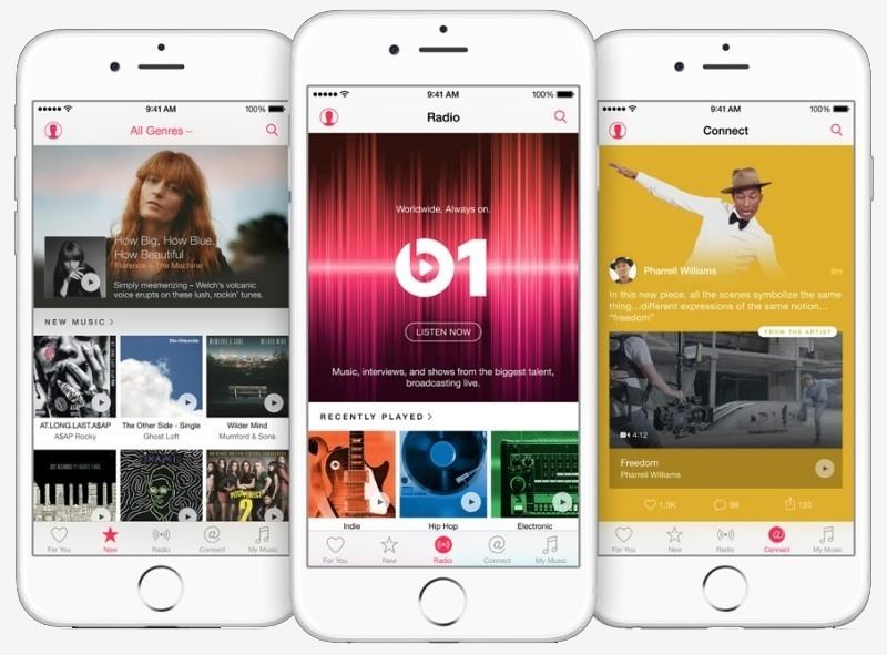
Apple Music… Nope, I've never understood it either…
To confirm that this is an issue, we recommend using tools such as UserTesting. For a fee, they’ll get a real person to walk through your site, highlighting problems that they find which you may not have been aware of. They’ll screencap the whole thing and provide commentary, and it’s scary how many SaaS product walkthroughs end with the reviewing simply saying “I don’t know what to do next”.
Here’s an example walkthrough:
Fixing user confusion can be as simple as adding better visual hierarchy, clearer prompts, or perhaps a guided tour.
What to try:
- Watch over someone's shoulder as they go through your process for the first time
- Ensure you know what YOU want users to get out of the first session. If you don't, no-one else will!
- Strip down your requirements to the bare minimum. Try to find the fastest path to value for a new users. How quickly can you show them how powerful your software is?
Apathy
Does your customer care? Not about your product — they signed up, after all, so we can assume they care about the product. But do they care about what you’re trying to get them to do?
Researchers have shown that we're instinctively more likely to do something if we know more about the outcome and reasoning, thanks to a cognitive bias know as Ambiguity Effect.
Essentially, humans value having information more highly than not having it — we have an in-built 'rule of thumb' which tells us to avoid options when information is missing,
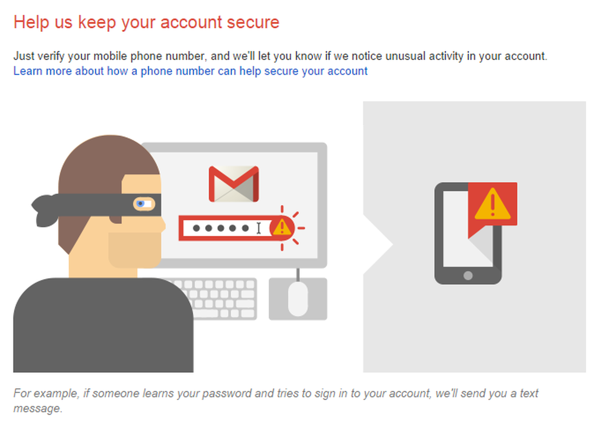
A good example of using this in UI can be seen in the ongoing shift to two-factor authentication — most companies rolling this out now realize that asking for a phone number is a big step, especially when users have traditionally used email to identify themselves.
To maximize the chance of those users understanding and caring, in most cases you'll find a polite explanation of why a phone number is required by the organization in question:
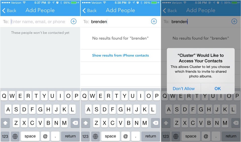
Another great example comes from the team at Cluster in this TechCrunch post, in which they explain how tweaking permission requests during setup let to a huge boost in engagement:
What to try:
- Review WHAT you're asking users to do in the first few minutes after signing up for your product
- Ensure you're providing appropriate explanations at each point, so they understand what they're going to get in return for their efforts
- Paint a 'big picture' along the route. How will a user 'win' by using your app? Ensure they're reminded of this scenario regularly.
Frustration
If the steps you’re asking users to complete are difficult, it’s almost guaranteed that you’ll be frustrating some of your users.
Apps commonly go wrong here by not testing their own flows well enough — it’s a constant surprise to us that so few developers regularly sign up to their own app after they’ve coded it.
Because of this, they rarely have insight into how long it takes to complete common tasks or required actions, especially for non-technical users who may not be as fast at form filling!
If you’ve ever tried to use Paypal for anything more than a simple payment, you’ll understand the feeling — endless redirect loops, random error messages and a general feeling that the people who built the backend have never actually used it (no wonder every sane developer now uses Stripe).
So consider the steps that you’re asking users to complete and whether you’ve made it as easy as possible for them. If you require a file upload, can the user upload multiple formats? If you require a profile picture, can the user connect to Facebook and import it? If it’s a URL you’re working from, have you provided an example do they don’t need to provide their own?
What to try:
- Front-load the easy stuff. The user should never leave the first experience thinking 'that was hard work'
- Look for shortcuts and plugins that can make the hard stuff easier
- Cut down on form fields. Always cut down on form fields
Fear
Fear of the unknown is part of human nature. According to researchers, we’re far more likely to react badly to the unknown than we are to a risk we can comprehend. That's according to Dr. Roger E. Kasperson, director of a risk study center at Clark University in Worcester, Massachusetts, quoted in the New York Times.
'People climb mountains and expose themselves voluntarily to all kinds of risks, but they don't like risk inflicted upon them that they don't understand or have control over, like West Nile [Disease].'
If you’re interested in the biology behind it, scientists believe that our risk evaluation is controlled by the central amygdala, the tiny part of the brain which is also responsible for the fight or flight response. People with damaged amygdalas have been shown to react more favorably to a situation that features uncertainty, according to scientists from Caltech and the University of Bonn.
So how should you apply this to customer onboarding? Put simply, make sure your users understand what comes next, and are 100% comfortable with it.
A good example of where this often goes wrong is with social media integrations. After I click ‘Connect to Twitter’, what happens then? Is the app going to spam all of my contacts?
Good onboarding processes pre-empt these concerns or design around them, leaving a user who's confident in every action and every consequence.
What to try:
- Communicate as much as possible, especially if you're dealing with personal data or permissions from the user
- Showcase what happens next, if you can. Providing certainty in an uncertain framework helps to reduce our perception of risk
- Don't ask to get married on the first date! Consider making early steps as commitment-free as possible, so that users don't experience fear in those crucial first minutes after signing up
Groundwork
One thing that’s guaranteed to turn off users is when expectations aren’t clear up front.
A good example of this which affects many SaaS apps is data importing.
If a user needs to import data into your app in order to make it work, you’d better make sure they’ve got that data ready, or you’re heading for instant churn. It’s remarkably difficult to attract someone back to complete a task, especially an arduous one.
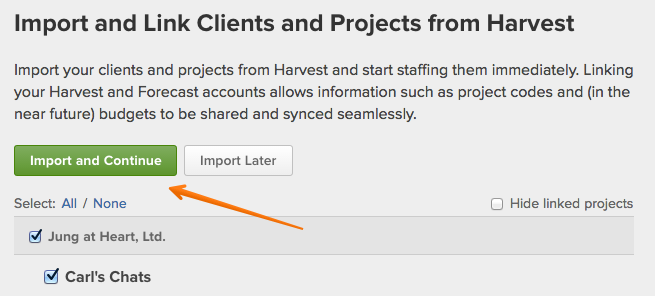
For this reason, it's a good idea to follow the example of the folks over at Harvest/Forecast and offer a nice, clear 'Import Later' button.
If the action is critical and simply must be completed, fine. However, consider priming your users before they sign up, so that they're aware of what they'll need to do and aren't faced with a nasty surprise in the first couple of minutes of using your app.
Or better, follow the example of Customer.io and do it for them, as outlined in this blog post about concierge onboarding.
What to try:
- Offer users the option to do things later, if possible
- Provide dummy information in case the user isn't ready to do all of the work right now
- Consider how much value your app can provide without all the groundwork
Cost
Finally, make sure you’re cognizant of what each onboarding step is costing the user in terms of either time or money.
In many cases, users subscribe to a SaaS service because they think it’s going to save them time or money — so the worst thing you can do is suggest that they were mistaken by requiring expensive steps upfront.
If your app does require a significant investment, better to stretch that investment out over the long term and identify areas where you can deliver value quickly, rather than hoping you’ll be given the chance by new customers who aren’t 100% bought into what you’re offering yet.
What to try:
- Rethink your customer onboarding flows in terms of time investment – are you providing the shortest route to value?
- Make the necessary investments clear up-front – let users know what step they're on, how many more there are, etc etc
- Don't ask for money until you've shown some value (if you can possibly help it)
Just… Focus on what's next
You might have seen us mention the concept of 'key activation events' in the past – they're absolutely critical for a good customer onboarding process. We mentioned them in our guide to customer onboarding here, in fact.
The mistake too many people make is trying to rush a user through their lifetime with a product in the first session, which is always a recipe for disaster.
Great apps understand that users have made an investment in them and take their time taking clients on a journey, moving them from point to point (normally with the difficulty and expected value increasing along the way).
Thinking like this is the best way to ensure that you don't overload users in that critical first session by asking for too much and then providing too little. Just focus on the next key activation event that that user needs to hit, and you'll find that the path to success clears far more quickly.
And if you don't know your key activation events? Well, you should probably spend some time researching them before you go much further…
Good luck!