Done right, SaaS onboarding tooltips can make the difference between cultivating loyal users that understand your software’s value and frustrated users who can’t use it properly. Yet while the average user might see them as simple buttons that guide them through using certain features, designing good tooltips can take some work to get right.
At Nickelled, we believe in the power of educating users (or employees) so they can get to grips with your software effortlessly. We’ve got this down to a fine art, and this article will give you a guide to one of our most powerful weapons: The tooltip.
What are SaaS onboarding tooltips?
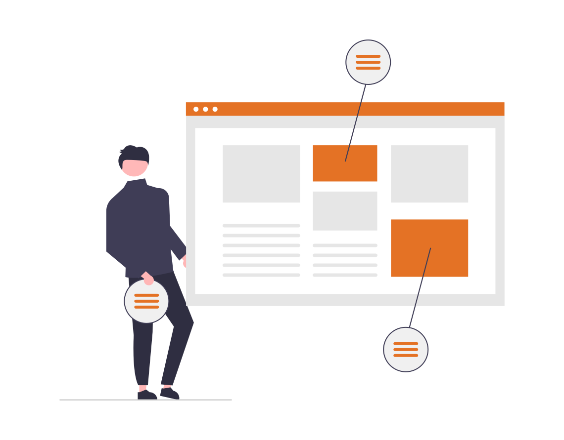
SaaS tooltips are targeted informative messages that appear when someone interacts with an element in your SaaS platform. They tend to involve icons or buttons a user can hover over and interact with to learn more.
So, SaaS onboarding tooltips are tooltips that specifically help with onboarding customers to teach them how to use your SaaS effectively.
One example of a tooltip you’ve almost certainly used yourself (unless you’re terrifyingly young) is Clippy the paperclip from Microsoft Word.
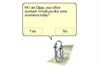
Love or hate the guy, he’s the quintessential example of an interactive element — and you can create your own version (maybe a slightly less annoying one) for your SaaS platform.
How can tooltips facilitate the SaaS onboarding process?
What would you rather use to learn how to use a new piece of software: A wall of text to sift through, or an interactive guide that visually teaches you the information you need to know?
Even if you personally would opt for a wall of text, people have different learning styles, and tooltips are ideal for those who learn through doing.
No, they’re not perfect. Some may object that tooltips are annoying or state the obvious. We’ll cover how to minimize these issues later.
For now, let’s just say that neglecting tooltips will likely cause bigger problems. Here’s why.
Direct users to the right features
In some cases, users may be able to figure out the basics of how to use your SaaS software without a tooltip’s help. But that doesn’t mean they’ll be able to use it to its full potential.
And if they don’t realize all the great features you have to offer, they may decide not to adopt your product.
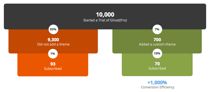
Ghost learned this firsthand. By nailing its onboarding flow and directing users to the right features, the hosting provider increased its conversion rates for free trial participants by 1000%. How? It realized that those who tried a custom theme were more likely to pay for a subscription, so it created a “blog setup” progress meter combined with email reminders to nudge users into doing this.
If you create a tooltip, it can act as this “nudge” for your customers.
It can be a great way to troubleshoot if the software you know is amazing isn’t getting the recognition you feel it deserves. You can also create more comprehensive tooltips for complex products with low usage.
SaaS onboarding tooltip trigger examples
If you still have doubts over whether onboarding tooltips are worth it (c’mon!) or you’re so eager to get started that you’re looking for inspiration, we’ve got you covered.
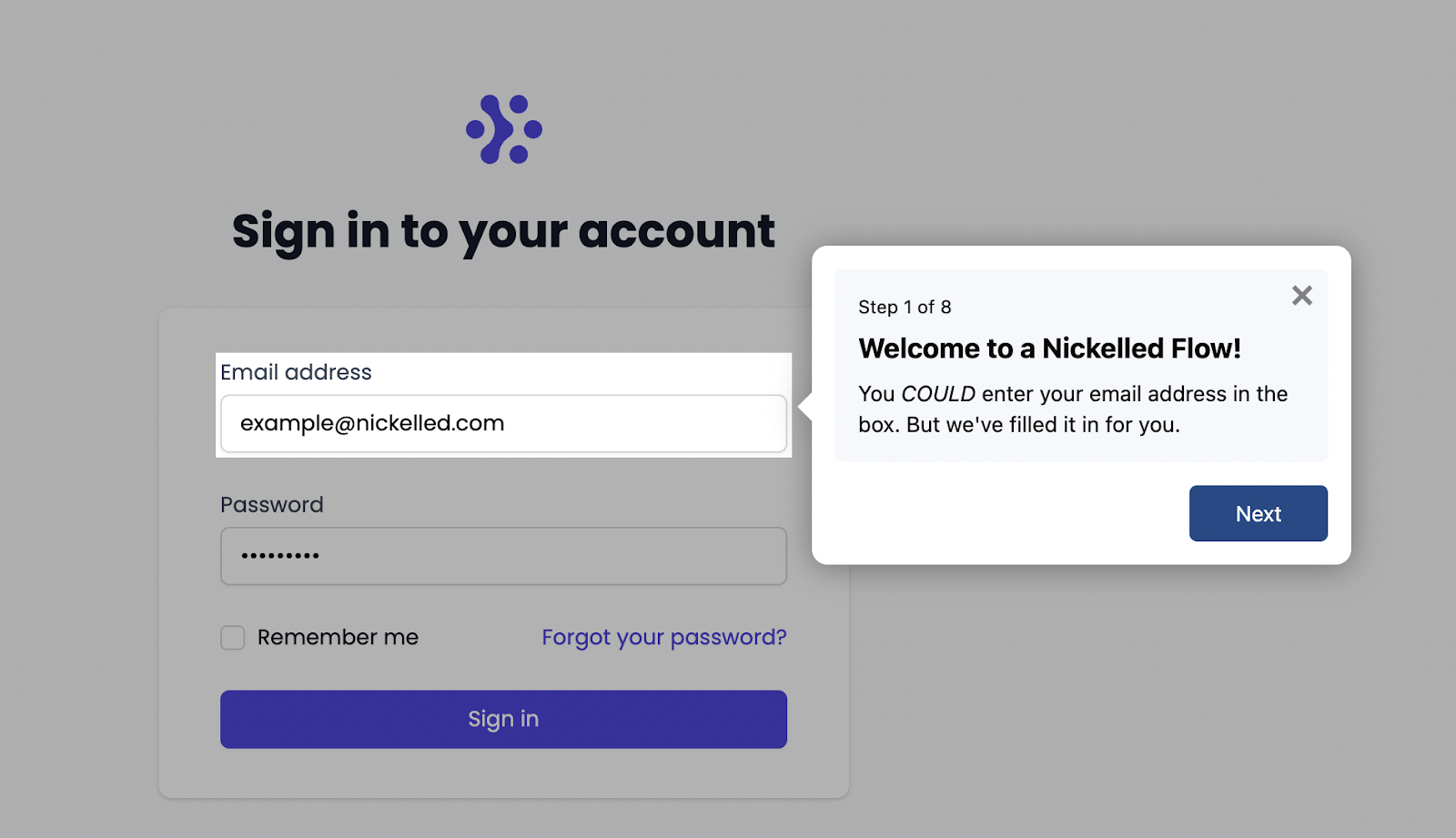
Let’s start off with our very own example from Nickelled (you can also check out the interactive demo yourself if you want to see it in action).
First off, the user is walked through the sign-up process through a series of boxes with (very simple) text outlining how to create an account. These boxes can also be closed at any moment for the users that don’t need them.
Here are five further examples of when tooltips can pop-up during the onboarding process.
- Hover over
Continuing with the Nickelled example, once the user has signed up and goes to the main interface for the software, they will see a few more text boxes to get to grips with key features. Then, they’re given their own space to investigate further.
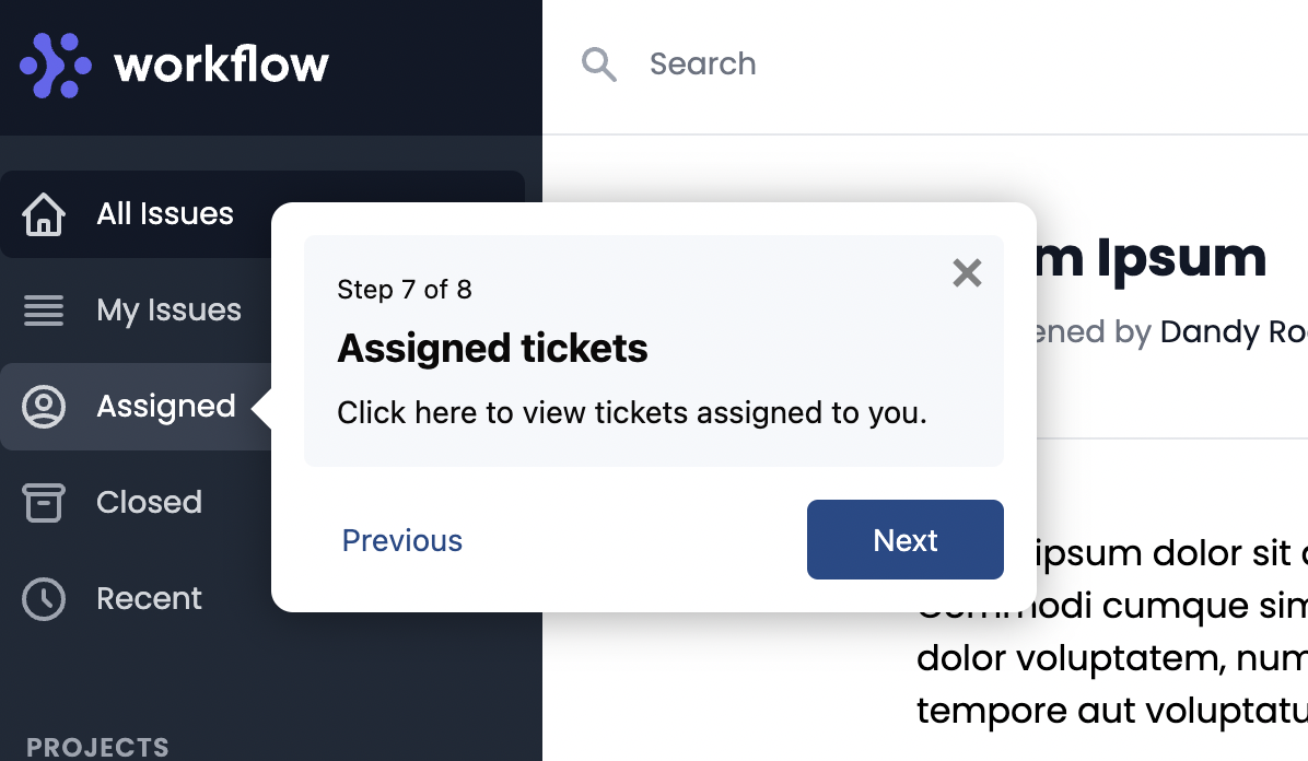
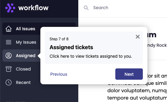
One of the more subtle onboarding tooltips they’ll encounter is the option to hover over or click an icon to see a tooltip with further guidance. Nickelled calls these Hotspots, and they’re a great way of catching a user’s attention so they focus on the most important features they might have missed otherwise.
In the example below, users can click a question mark next to the “assigned” option on the menu to learn how assigned tickets work.
- Typing
Another way to include a tooltip is when a user starts typing something. The tooltip then activates to help them complete the process. For instance, it might give advice on how to use the search bar effectively.
- Tutorial
In some cases, you may prefer to provide a complete tutorial rather than a few interactive elements. In this case, tooltips will continuously appear to walk a user through the onboarding process.
- Triggers
When triggers are used, the presence of tooltips won’t be immediately apparent. Instead, they will only be activated when a user does a certain action. For instance, this could be clicking on a certain feature.
- Time-activated
Worried that your tooltips might be superfluous? Time-activated tooltips solve this problem by only popping up after a certain amount of time, meaning that only the users who truly need them will see them.
Best practices for implementing SaaS onboarding tooltips
Now, we’ve covered the basics. But there’s a difference between adding onboarding tooltips to your software, and doing an excellent job of onboarding tooltips.
Here’s how to make sure you fall into the second category.
Factors to consider
There are four elements that all tooltips need to get right:
- Text. The words you choose need to provide contextual information to the user in a clear, concise way. Keep things simple!
- Button. These are essential to prompt the user to take certain actions and allow them to navigate between elements.
- Colors and design. By using contrasting colors or different designs, you can help a tooltip stand out from everything else on the page.
- Proper placement. Putting the tooltip where it is most likely to be discovered makes all the difference as to whether a user will spot it. Make sure a tooltip doesn’t take up the entire screen or block other interactive elements.
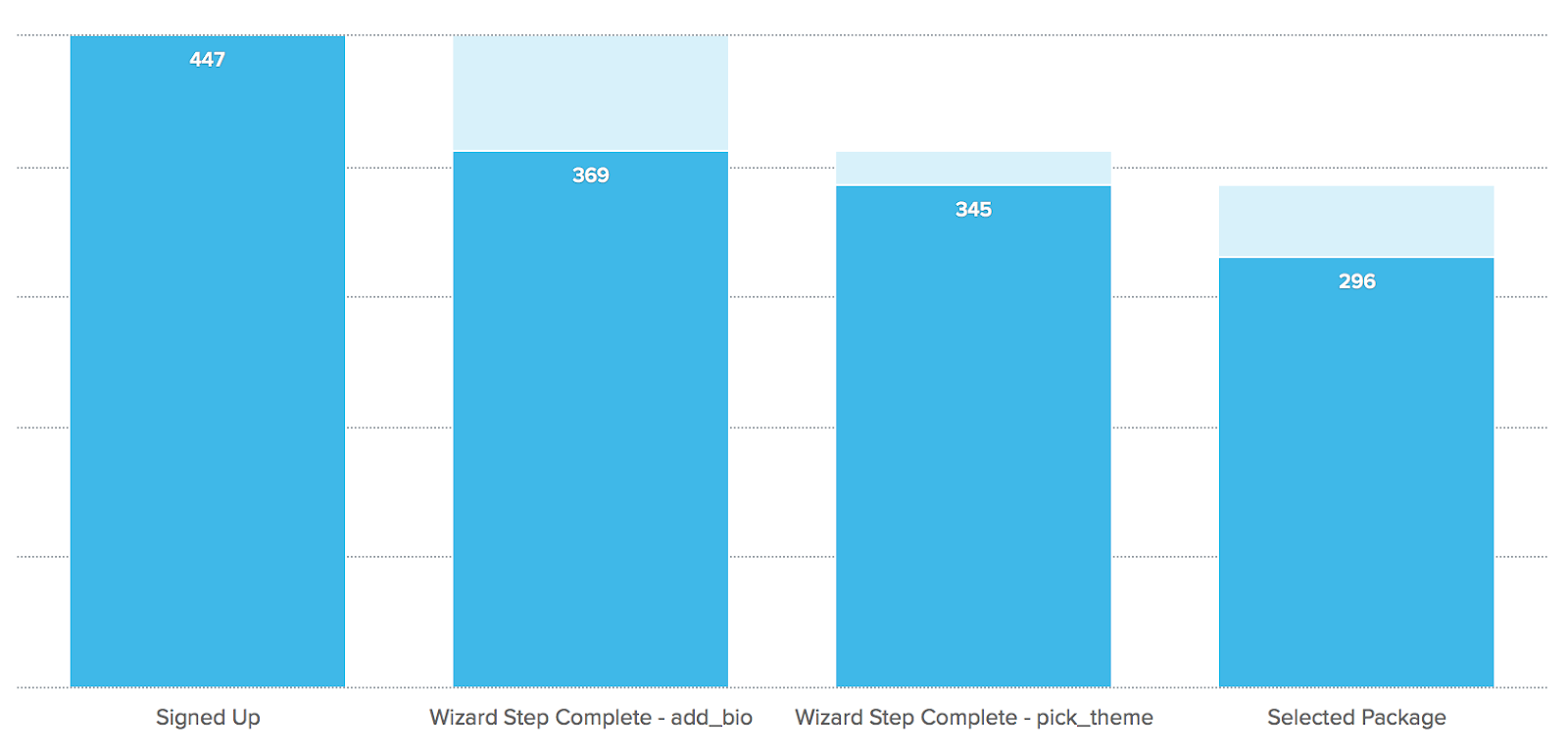
- Analytics. You also need to make sure you track the right metrics when you’re examining how users interact with tooltips. This helps you to figure out if users are finding them useful and interacting with them how you expected. Pay attention to completion and satisfaction rates, any drop-offs in use (which dictate you need to communicate better), and possibly the progression of individual learners (if they use certain features successfully after the onboarding). For instance, how many of those who signed up went on to select a package?
Create a prioritized list of onboarding flows based on data
Perhaps the most pivotal part of tooltips is ensuring you provide elements for the most relevant parts of using your software.
This is going to be different for every business — just like Ghost did in the earlier example. You need to refer to your own data to figure out what your users need help with.
Primary onboarding
It could be your registration process, your primary onboarding flow (with the most basic features or the secondary onboarding flow (with more advanced features).
Here, you should focus on the features that are essential to use your software properly and to reach the point where your user persona will actually reap the benefits. It’s all about helping the user reach the point where the value of your product clicks.
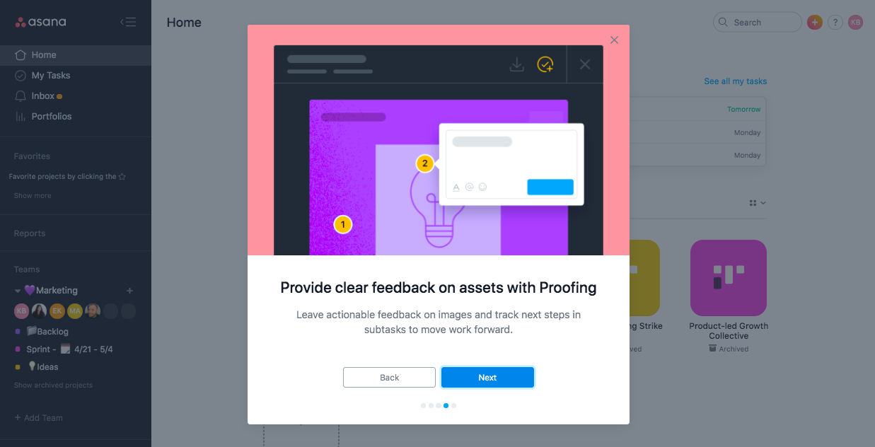
Just refer to Asana’s onboarding flow for a masterclass. As users complete their onboarding flow and work through the adoption guide, they receive prompts if they navigate away from the product, such as more advanced tips they may have missed out on. This keeps them engaged if they’re losing patience.
Secondary onboarding
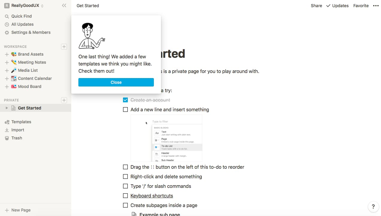
As for secondary onboarding, Notion does a great job with its task-based product tour. After users complete the basic onboarding flow, they receive a tooltip that sends them to the “getting started” page. This means they can explore more advanced features without being pushed into them.
Tertiary onboarding
In some cases, you may even want to include tertiary onboarding, which focuses on introducing new features to existing customers.
Instagram did this when introducing Instagram Reels. It onboarded users to its new feature by giving them a quick walkthrough of how to create a reel when they clicked the “create a reel” button for the first time. Simple but effective.
Optimize the tooltips for engagement and ease of use
Once you’ve just about planned out your tooltips, there are a few elements to check you got right.
Firstly, make sure you keep things brief. Any text shouldn’t be more than a sentence or two long — the more concise, the better. You can refer to our interactive demo we introduced earlier.
And since not all users are going to need the information you’re providing, be sure to offer them an intuitive and easy way out. You can do this by either clicking away or pressing the “skip” button. Whatever you do, don’t make the tooltip take up the whole screen.
Finally, make sure that the button has a clear call to action. What do you want the user to do? Don’t leave them guessing. It could be as simple as getting them to navigate to a specific page or click a button.
Time to level up your onboarding
Tooltips might be simple, but as you can see, a lot goes into getting them right. Make them too complex, too invasive, or too confusing, and you could turn your users away instead of inviting them in.
Want an easy but effective way to create the best tooltips possible? Check out Nickelled — we can help you create tooltips to make sure your customers “get you” like you know they should and maximize the chances of them sticking around.