This month, we launched new guided tours which are fully compatible with Salesforce, bringing Nickelled’s simple, easy-to-use guided tours into the world’s most popular CRM software for the first time.
Ever since the Winter 20 release of Salesforce Lightning, we’ve fielded a lot of questions from clients and potential clients who’ve been looking for Salesforce In-App Guidance alternatives, so in this post, we’ll take a look at the differences between the two options and why we think Nickelled might be a better choice for many companies when it comes to Salesforce guidance.
What is Nickelled for Salesforce?
Nickelled for Salesforce is a simple Custom Lightning Component which can be launched on Salesforce pages to provide in-app guidance to users based on role, team, app, page, or almost any other criteria you can think of.
It integrates with the simple Nickelled guide creation and guide management tools our customers already know and love – it’s easier than ever to create, update and manage all your guided tours from our cloud-based software.
Here’s a quick video introduction:
Nickelled guides are served inside Salesforce and are perfect for walking new users through your processes or highlighting unused features or functionality to existing users.
What is Salesforce In-App Guidance?

If you missed the release of Salesforce In-App Guidance in the Winter 20 edition, we can’t blame you – it was a little buried, but it essentially brings the ability to customise the helpful popup prompts which have been used in Salesforce for a while. So instead of Salesforce writing those prompts, you can now write them yourself and define where they appear, what they say, what comes next, etc etc.
Their reception was pretty positive – Salesforce Ben has described them as one of his “favourite new features”, noting that the functionality “gives us the ability to “demystify” buttons, things, features and functionality that can make a huge difference for end-users that may otherwise go unused”.
This video gives a nice overview of the capabilities of the tool:
And as a company that has been making user onboarding and training software since 2014, we should also say that we’re firmly in favour of anything that can deliver smart, helpful prompt to the user at the right time, without interrupting their workflow. So, kudos to you, Salesforce!
What are the key differences between Salesforce In-App Guidance and Nickelled for Salesforce?
It’s important to note that while the functionality rolled out by Salesforce is a handy tool, it’s simply no match for a fully-featured digital adoption platform offered by the likes of Nickelled (and our competitors such as WalkMe).
When playing with Salesforce’s In-App Guidance, we noticed a few implementation limitations and a whole load of strategic limitations, which we’ll try to cover off in this section.
Limited Definition
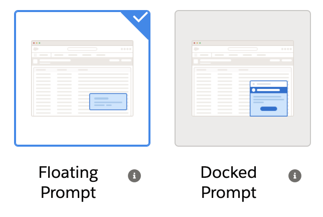
One of our immediate gripes was that the prompts offered by Salesforce are super vague, positioning-wise. You can choose only a toaster position (at the bottom right of the page) or a general page area for the floating box. This makes it tough for the prompts to draw attention to specific features on the page – if you were hoping to tell someone “click this button”, that won’t be possible. You’re limited to placing a prompt close to the button and hoping you can textually draw their attention to it.
This is a huge drawback in a user interface that’s as complicated as Salesforce – it’s why Nickelled for Salesforce supports greying out the rest of the page, for instance, so that users focus only on the thing that you want them to focus on.
Hard to manage anything other than a simple flow
For many Salesforce implementations, training users on process knowledge is as important as teaching them what’s on each page. It’s clear that the standard in-app guidance was not built for this.
For example, if you have a process which walks a user through five pages as part of a flow, and has them filling out data along the way, it’s impossible to record that process. You could take them to each of the pages and show prompts (just about), but since In-App Guidance can’t seem to capture open modals and definitely can’t show users how to enter text in a modal, it’s not especially helpful for the user who’s wondering how to run through a whole process.
Nickelled for Salesforce, by comparison, allows you to capture open modals and even enter text into them as an example for users, before saving the text and moving onto the next page.
Limited trigger options
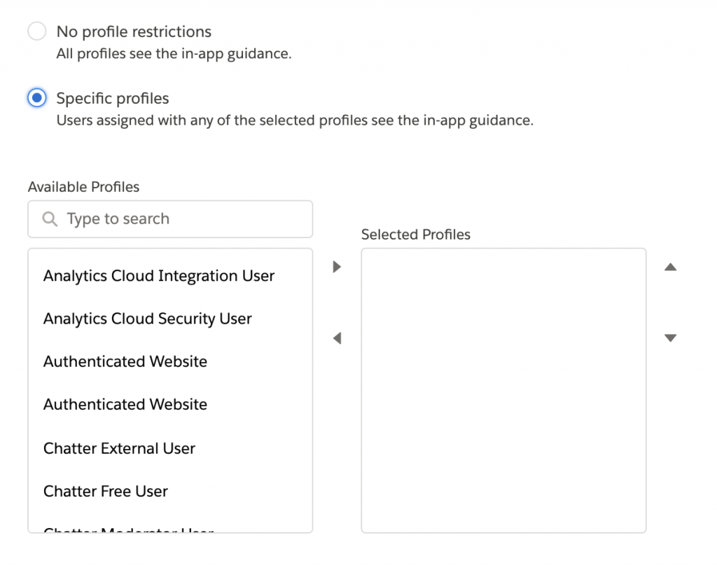
We were actually impressed that Salesforce allows the launching of tours based on user roles, but that’s not enough for a functioning, useful digital adoption platform. Delivering only relevant information to users is absolutely critical to a successful training programme, but user roles don’t provide the level of granularity you need – an experienced user comfortable with the system should not be shown the same information as a new joiner to the company, for example.
Many Nickelled users want to differentiate between new and existing users, different teams, different levels of seniority or different nationalities/languages, and as far as we could see, none of that segmentation is possible using the standard Salesforce guidance.
Only works in vanilla Salesforce
Although Salesforce In-App Guidance looks great inside the default Lightning experience, it’s not possible to take it any further. If you’re looking to run on a screen which isn’t the default Salesforce homepage, list or record screen, or you want to have a guided tour inside a heavily-customized Force.com, Apex or other app, they’re simply not going to do the job for you.
Any colour you want (as long as it’s blue)
Have a beautiful theme inside Salesforce and want your In-App Guidance prompts to reflect that? Sorry, no can do. Unlike Nickelled guided tours, which can be customised with brand-friendly colour schemes (and even overwritten with custom CSS), Salesforce In-App Guidance steps are only available in one colour – and it’s theirs.
How does the Nickelled for Salesforce widget work?
When using Nickelled for the first time, you’ll notice it’s different to the way Salesforce chooses to do things.
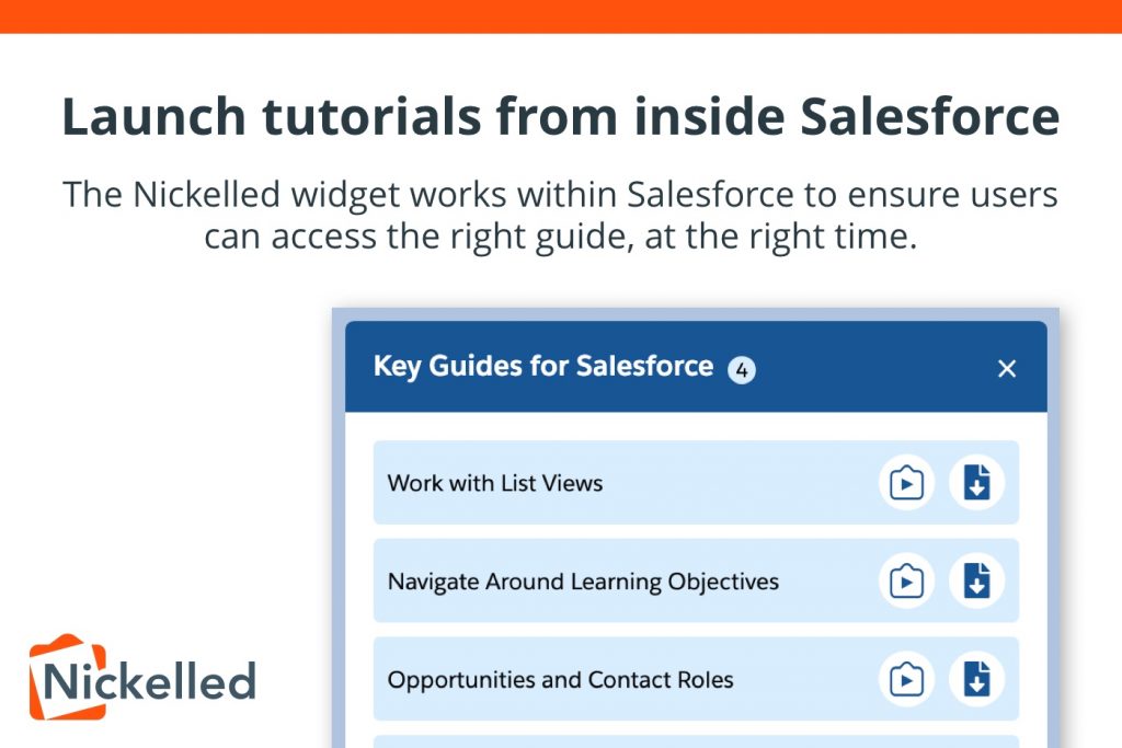
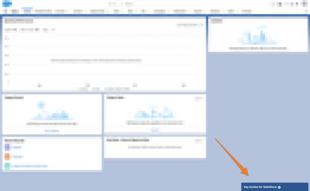
The Nickelled for Salesforce launcher sits at the bottom of the page, and displays as long as the user criteria and the URL criteria match (for instance, users in the sales team viewing the sales app):
It’s minimised by default, but clicking on it brings up the selection of guides that are available for that user (again, customisable by a set of matching criteria):
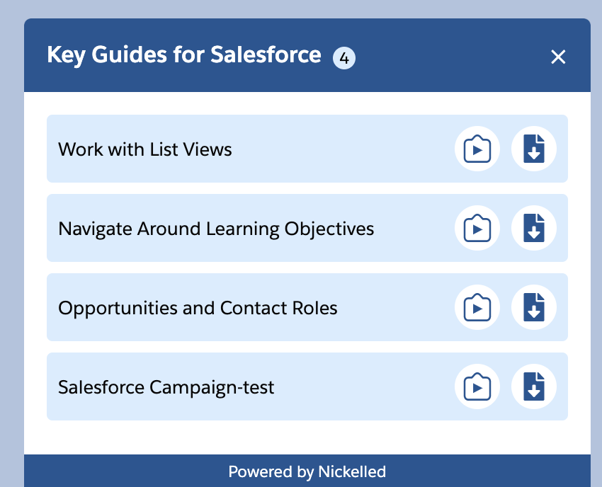
Each of those guides is available in two formats, and this is where the power of Nickelled’s in-app guidance really shines.
The first format is an interactive walkthrough – select this option, and the walkthrough will open up over the Salesforce window and begin to play back the guided tour in an immersive interface. Here, the user feels like they’re really inside Salesforce, and they’re able to click around, jump from page to page, and watch forms being completed right in front of their eyes (don’t worry – data entered inside an interactive walkthrough isn’t saved).
When the walkthrough ends (or the user chooses to exit), the window disappears, and the user returns to the page which they were previously working on.
Option 2 is a surprisingly popular option – download the guided tour as a PDF file for future viewing! Clicking this option will open a new tab and automatically download a PDF version of your guided tour to the user’s machine, which they can open, save for later or print (as a last resort).
Both of these options remain available to the user so long as they match the criteria.
A Learning Homepage with the Custom Tab
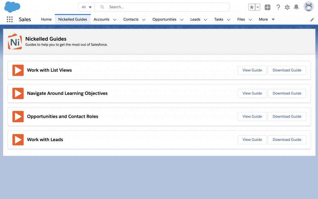
The Nickelled for Salesforce widget is great for providing contextually relevant prompts as the user navigates inside Salesforce. But if you just want a single page for learners to visit to see all of their guides, the Custom Tab is a neater solution.
Available for addition to the Tabs ribbon at the top of the page, this set of guided tours can be easily configured on a per user basis, but shows a much higher number of guided tours. If you’ve ever wanted a full knowledge base inside Salesforce for users to access at any time – this is it.
As with the Widget, users can view or download each guided tour, and the selection can be customised by administrators according to user role, app, team, manager or any other parameters on the user record.
The Custom Tab is ideal for lifelong learning – we find that users still return to it time after time, as it’s a single-click place which holds all of the process knowledge and user interface information that they may require during their workday.
Guide Creation, Editing and Management
While Salesforce In-App Guidance tours need to be created and edited inside your Salesforce organisation, Nickelled provides our proprietary guide editing tools. This allows far more power and flexibility in editing than the standard Salesforce interface does – you can reorder steps, add modals, delete pages, insert new pages, or update specific pages you’ve recorded (for instance, if you realise you’ve skipped a step while recording).
Since Nickelled captures and caches pages during your recording, you can also be confident that the guide will play back exactly as you expect it to – no more worries about the right records not being present in the user interface, or the user not having the right privileges to see certain parts of the app. Nickelled guides function more like a video – albeit one which can be easily captured, edited and interacted with.
Salesforce In-App Guidance cost vs Nickelled for Salesforce pricing
Nickelled has always tried to be fair and transparent about our pricing, and we’re continuing this ethos with our Nickelled for Salesforce product too.
Pricing for Nickelled for Salesforce is per-user, starting from $0.38 per user per month, and operates on a sliding scale up to $5 per user per month (for implementations with fewer than 50 users). That’s the only fee you’ll pay too – there are no upfront implementation fees or other charges levied to use Nickelled at all.
Salesforce In-App Guidance is tied to a myTrailhead license for every user who uses In-App Guidance. These licenses are $25 per user per month, paid in addition to the standard Salesforce license cost for each user.
If you solely require in-app guidance, we believe that Nickelled for Salesforce is a far more economical choice for most organisations. Book a demo to find out more.
The bottom line
Any training programme, inside or outside of Salesforce, needs to consider the knowledge requirements of the audience and the teaching methods which will be most effective for the material.
When considering the best solution for Salesforce guidance, therefore, we strongly recommend that you take a traditional approach to training strategy, even though we’re now blessed with all these new forms of guidance and digital adoption systems!
Doing so will allow you to reflect on the amount and the sophistication of the guidance you require for your user base, and will help you come to the right decision that will maximise success for your company.
And, if you have any questions along the way, we’ll be right here to answer them!